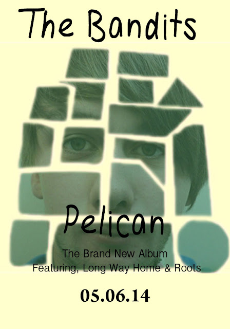
This is my groups initial idea for what we want our CD advertisement to look like during the post production stage of the course. We feel that our initial draft is interesting and conforms to the aim of a CD advertisement. We decided initially to go with a simple layout showing the CD cover main image. We decided this upon seeing that this was conventional to the genre, and bands similar to the image we wish to portray (Two Door Cinema Club, Arcade Fire and Kings of Leon) all have CD advertisements using the simple one image approach. We used a simple font to describe the most prominent songs on the album, as this is incredibly conventional of Indie album advertisements, often drawing those who are fond of single tracks into their whole album.
We looked through a recent NME addition and noticed that the majority of Indie Rock bands used simple; un-elaborate fonts to express the band title, and we therefore decided to conform to this idea, as we feel it portrays a band that are more about creating great music and less about the bands overall image. The
We looked through a recent NME addition and noticed that the majority of Indie Rock bands used simple; un-elaborate fonts to express the band title, and we therefore decided to conform to this idea, as we feel it portrays a band that are more about creating great music and less about the bands overall image. The


