Showing posts with label Construction. Show all posts
Showing posts with label Construction. Show all posts
Thursday, 7 March 2013

Wednesday, 27 February 2013


Wednesday, 6 February 2013


Monday, 28 January 2013
Wednesday, 23 January 2013


Thursday, 17 January 2013


Wednesday, 16 January 2013
Ancillary Task - Advertisement Development

For our first advert design, we came up with a simple yet, creative idea that we felt at the time would create an incredibly interesting CD advertisement. We created an image containing all 4 members of the band, combined to emulate a single person. We then laid this image over a picture of shaped card we had created, and used the transparency tool, to make the face blend with the green card. We used a simple shade background, as we were initially going for the "Kings of Leon/Arcade Fire" image, although after creating this we had almost completley opposite ideas, to that which we began in mind. After reconsidering trying to adapt our first draft, we decided to completley start from scratch, and go for an overall busier approach, to make the advertisement more visially appealing. We came up with an overall theme for our peice and decided, on a chalk/paint theme, making this peice compeltley original to other advertisements we had seen. We found a small board and covered it in lyrics from songs included on the album, aswell as little doodles and phrases that we felt connote youth. We then used contrast to make the colours pop more in the picture, and to darken the grey board. The overall result was incredibly pleasing to us. We decided to use a simple font to express the album details, as we felt trying to conform to the chalk theme with this would be too hard to actually see. We then created a short quote as a selling point for the album, as we saw this was a common theme within other advertisements; as are the band websites at the top of the advertisement. We then added all necessary companies and sponsores to ensure our advertisement looks proffessional, we will further tweak this for the next assessment.
Monday, 14 January 2013


Monday, 7 January 2013


Monday, 17 December 2012
Advert Development - Initial Layout


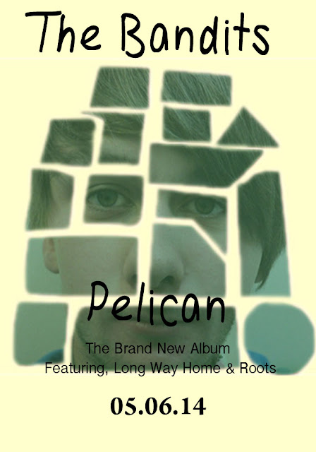
This is my groups initial idea for what we want our CD advertisement to look like during the post production stage of the course. We feel that our initial draft is interesting and conforms to the aim of a CD advertisement. We decided initially to go with a simple layout showing the CD cover main image. We decided this upon seeing that this was conventional to the genre, and bands similar to the image we wish to portray (Two Door Cinema Club, Arcade Fire and Kings of Leon) all have CD advertisements using the simple one image approach. We used a simple font to describe the most prominent songs on the album, as this is incredibly conventional of Indie album advertisements, often drawing those who are fond of single tracks into their whole album.
We looked through a recent NME addition and noticed that the majority of Indie Rock bands used simple; un-elaborate fonts to express the band title, and we therefore decided to conform to this idea, as we feel it portrays a band that are more about creating great music and less about the bands overall image. The
We looked through a recent NME addition and noticed that the majority of Indie Rock bands used simple; un-elaborate fonts to express the band title, and we therefore decided to conform to this idea, as we feel it portrays a band that are more about creating great music and less about the bands overall image. The

Subscribe to:
Posts (Atom)